
✨🎨🖌️🖼️✨ The art fundamental that you are missing | Composition
Let's examine several views on composition

Hey, artist rarely talk about composition but, as you will see, it is the foundation of every drawing.
So pour yourself something to drink: a cup of tea, coffee or a shot of whiskey, and let’s start.
The story so far: in the beginning, the canvas was created blank. This has made a lot of people very angry and been widely regarded as a bad move.
In front of the vast whiteness, the artist felt frozen. They needed a scaffolding, a suggestion on where to make their first mark, on what comes next.
And without a plan, a vision the artist felt lost.
When talking about composition, most inexperienced artists know about the rule of thirds and that's about it.
That is because this arcane knowledge is taken over by... designers.
It's true! The so called principles of design are in fact the toolbox that you need to achieve a composition that will serve your art purpose.
But before we get to the nitty-gritty of this gentle robbery, we have to puff up our definition of composition.
You may think that composition is simply how objects on the canvas are arranged.
And you will be correct!
But as artists, we don't merely want to be correct, we want to be complete, lively and wonderful.
So I suggest you think of composition as creating a new, awesome world or a moment ready to be visited by a timetraveler.
You know how when you are awaiting guests, you take care to put the pillows for good use, you hide the extra trinkets so that they don't brake and you try to arrange everything just so.
What is needed for a party to go smoothly is the same for a painting to be impressive.
Careful consideration.
In order to achieve our goal, every part of the painting has to be oriented to our goal.
That's why designers love it.
Let me explain!
But first, let's recover the part of composition that is most used and praised by cinematographers and photographers.
First and foremost, composition includes choices about what to include (framing) and where to place it (staging and blocking).
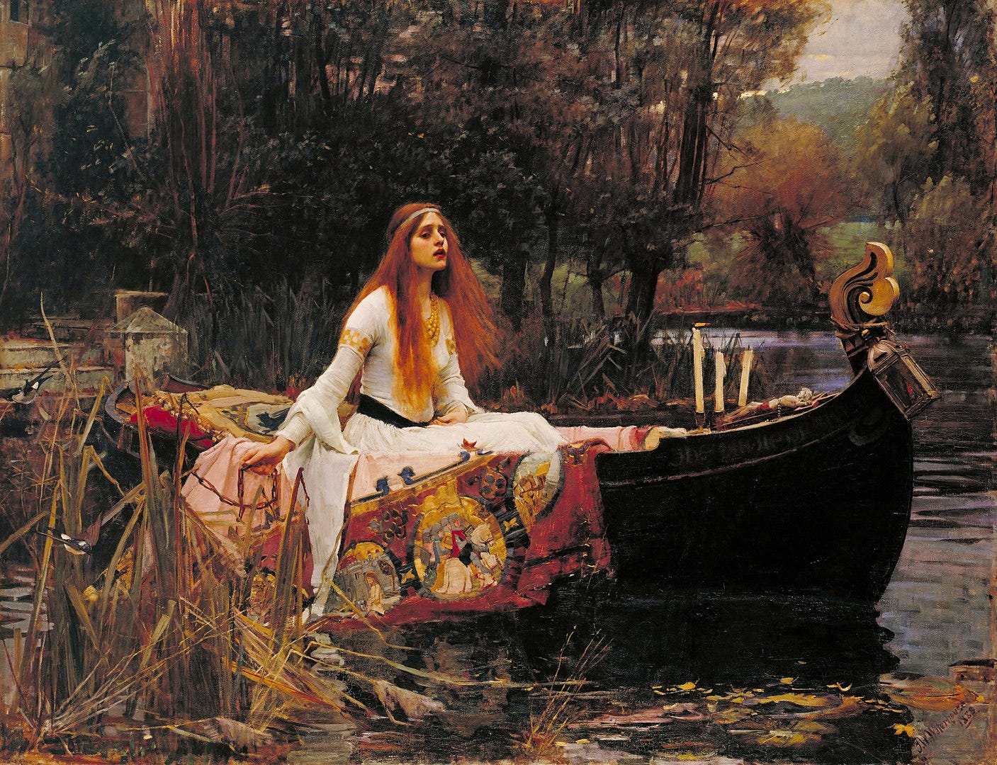
The choice of frame shows the viewer which part is important: a solitary figure next to a skyscraper can show how small we are in the modern jungle, the same but zoomed in can suggest the universe that can be locked in a human. From a scene with a path meandering towards a mountain top, we can choose to focus on a single flower on the side.
The choice of arrangement shows the viewer how the pieces relate to the whole and among themselves, which can in turn create a particular mood, emotion or reflection. Left or right? Illuminated or in shadows? Viewed from above or below? What is the point of view: on eye level, above or below, at an angle or straight? Is the horizon visible?
These two considerations serve to direct the eye where we want.
To chart the path, we can use some of the following:
leading lines
negative space or
placement.
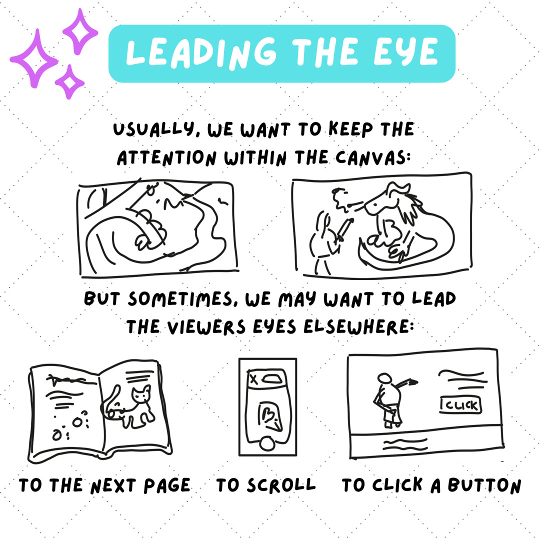
In most cases, with the exception of comic panels or ads, we want to keep the attention within the illustration. Then the leading lines can be more literal. For example the horizon line is usually the first that attracts our gaze, as well as rivers and roads in a landscape. Or can be suggested by a series of steps, a flock of bluebirds (on a wire on not) or stairs. They can also be curves such as the swoosh of a sword or a magic wand, branches and of course gesture, especially pointing because human beings are always curious to know what attracted someone’s attention.
Other option is to leave a lot of negative space. That way it is easy to not get distracted. The empty, surrounding space makes our object pop, especially if it is only a silhouette.
We can get the same effect by choosing the placement of the object or the figure. If we rely on the idea behind the composition rules, the most prominent points where we should place our main interest is off- center, below or above the middle of the canvas.
We can also use frames because we know that they are used for just this purpose. But here we are not talking necessarily about a formal frame but also windows, foliage or similar.
No matter what we choose, it should serve to lead to or accentuate the focal point.
To further show what is most important we can use:
scale and proportion
colour or
clearness.
Every object has its own size but in art we can exaggerate or diminish so that what we want to display sticks out the most. Scale refers to the relation between the objects and proportion to the relation between their parts.
Another way to attract attention is by making the outstanding object a different colour: depending on what is our palette, generally we can use a more saturated, darker or complimentary colour.
And also make the important parts have more focus which means more sharpness, brightness or detail.
Not bad so far.
Yet we can go deeper.
Now came the time to get to know the list of principles of design, well a list.
Because depending on who you ask, there are anywhere from 6 to 20 principles, some of which we already talked about.
Here I have reduced and grouped some of them under the same umbrella.
The majority keep the artwork together, the rest aim to distinguish parts of it.
And thus is in life: we prefer mostly the stability but with a side of adventure and novelty.
Without further ado, here are the principles that will improve your composition:
unity
balance
rhythm
space
contrast and
emphasis.
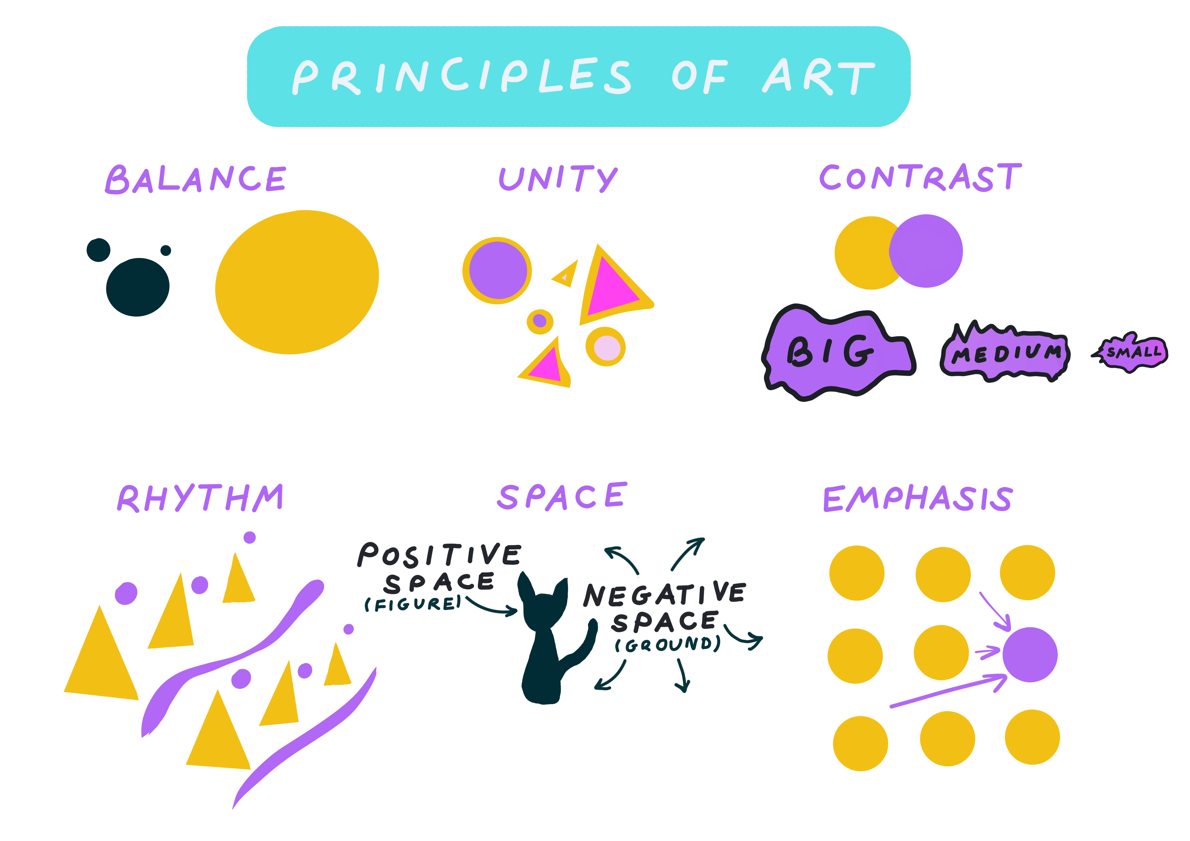
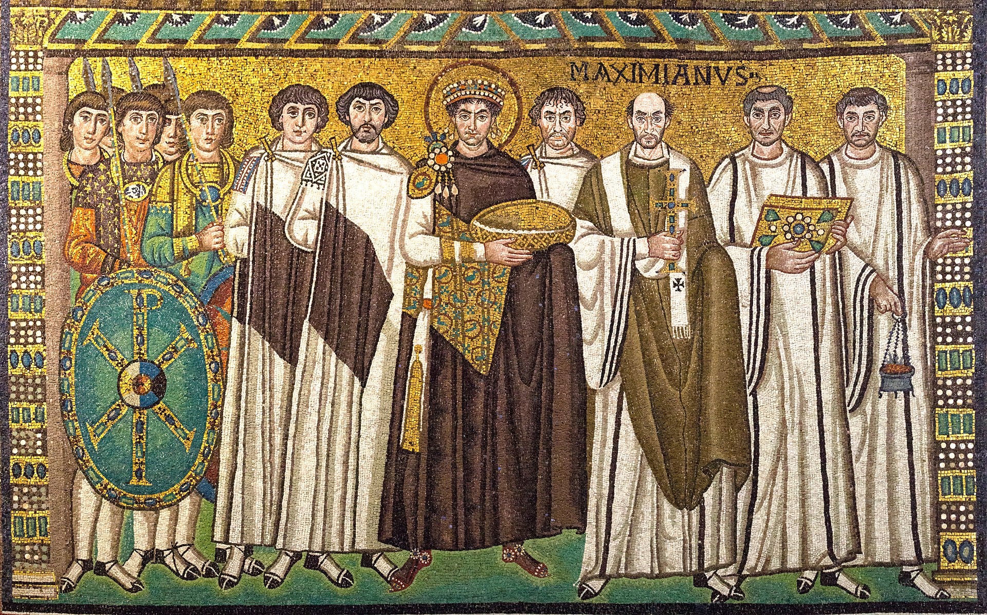
Let’s start with unity, sometimes called harmony, because if our artwork lacks it, everything will appear disjointed, just a random mess and not a powerful impression. So that all belongs together, even before we make our first mark, we have to set a clear goal which naturally leads to leave less objects, only the necessary. Of course we can have unity in a complex composition but it is easier with a simple one. An artist can use any of the elements of art such as line, texture, colour, and more to create the necessary cohesion.
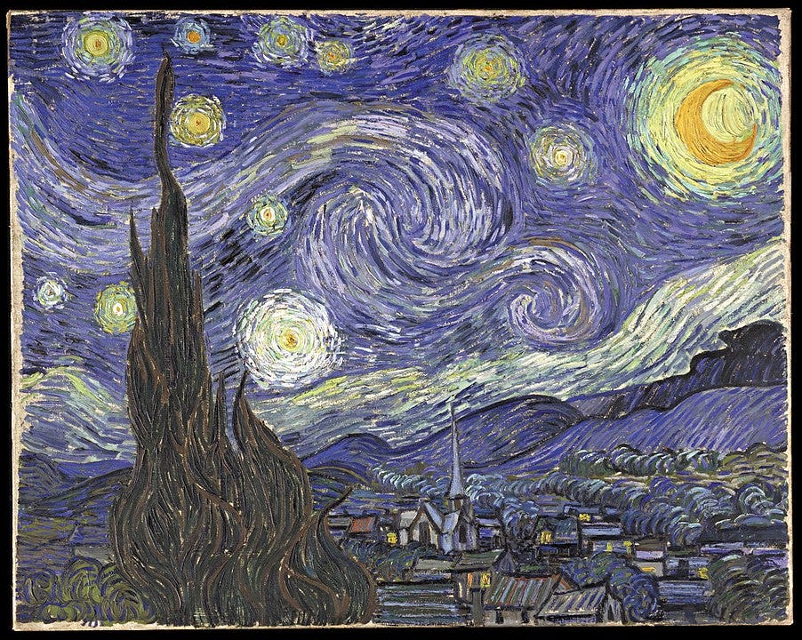
Our next principle can be of help too. Even though an artwork is usually thought of as unchanging and unmoving, a viewer’s interaction with it is not. The rhythm refers to sensation when we get when progressing through it when we look. Some paintings can be more static as we don’t have a compulsion to roam around the canvas but this can be good because it give us a calm, relaxed sensation, some can be dynamic leading us through intoxicating swooshes and flights leading to its main subject. To achieve the desired rhythm, we have the following tools at our disposal:
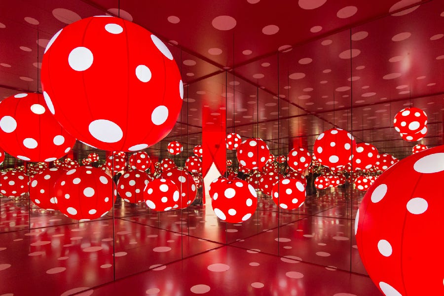
repetition
flow and
pattern.
By the repetition of lines, contour and shapes, we can create a tension between various parts of the artwork because similar elements make our eyes bounce back and forth. For example, if we have two trees, our brain will unconsciously try to compare them: which is bigger, where the shades fall, what are its particularities, so that we can be familiar with the environment. So if a cheetah suddenly jumps out behind the bush, how far should we run so that we can climb the nearest tree and escape. Also according to psychology, similar objects look like they belong together.
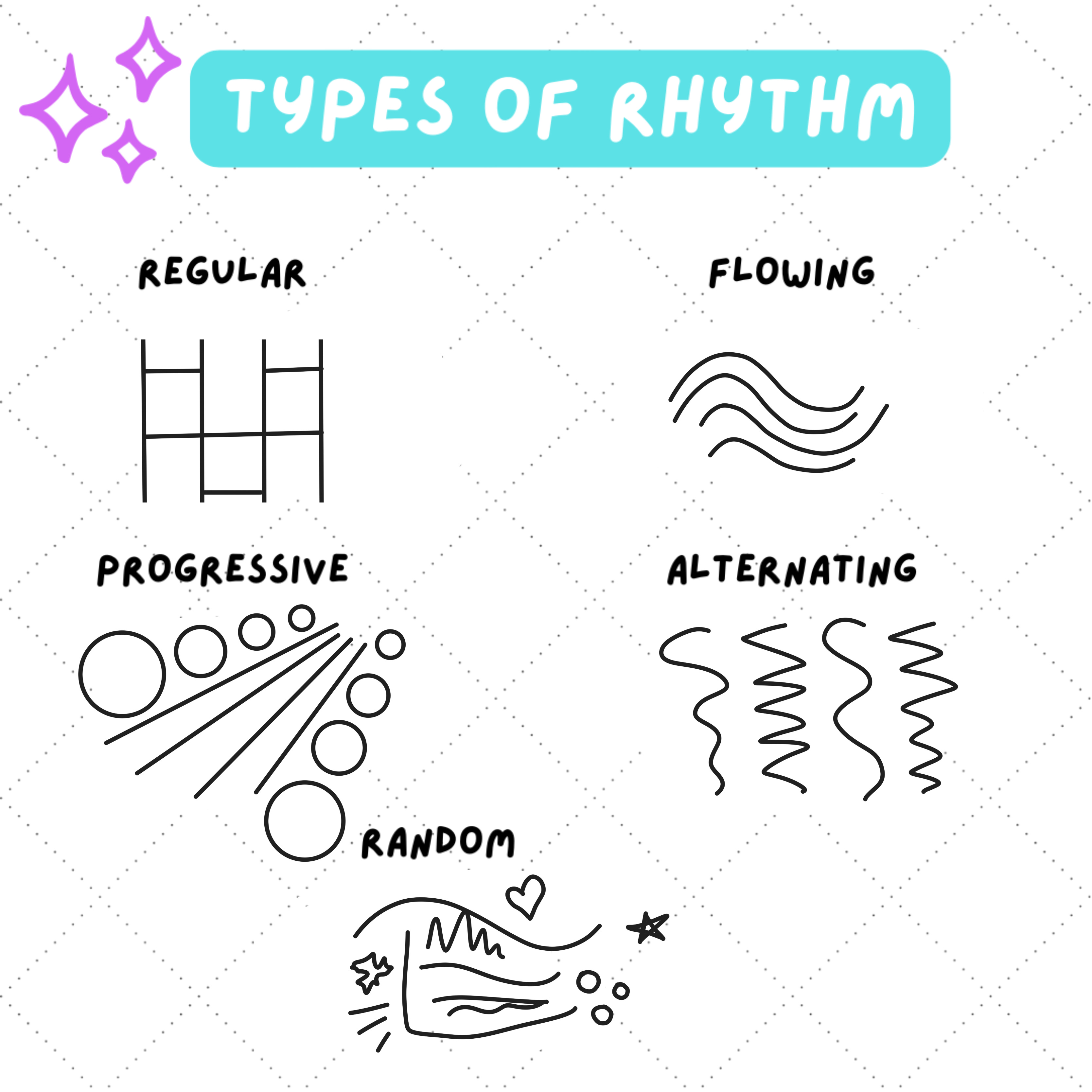
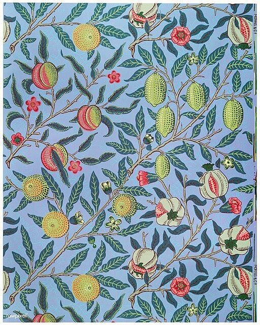
And since we are constantly looking for patterns, we are much more inclined to start our exploration here. But it may also be more subtle. For example, patterns in nature such as spirals, waves or tiles rarely are exactly repeating but are nonetheless regular. They may be rotated or reflected (as in a mirror).
In the most literal sense we can create a pretty pattern for a wall or a garment, both for the world inside the painting or the real world.
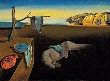
The flow, also called movement, is, as we already saw, deliberately carving a path to the focal point using mainly leading line and contrast. A composition with more curved lines or diagonal lines is more dynamic that one with straight lines, also if we use more varied colours. Adding an object in a state that is transitional such as a strand of loose hair, falling leaf or anything suspended in the air can enhance the flow too.
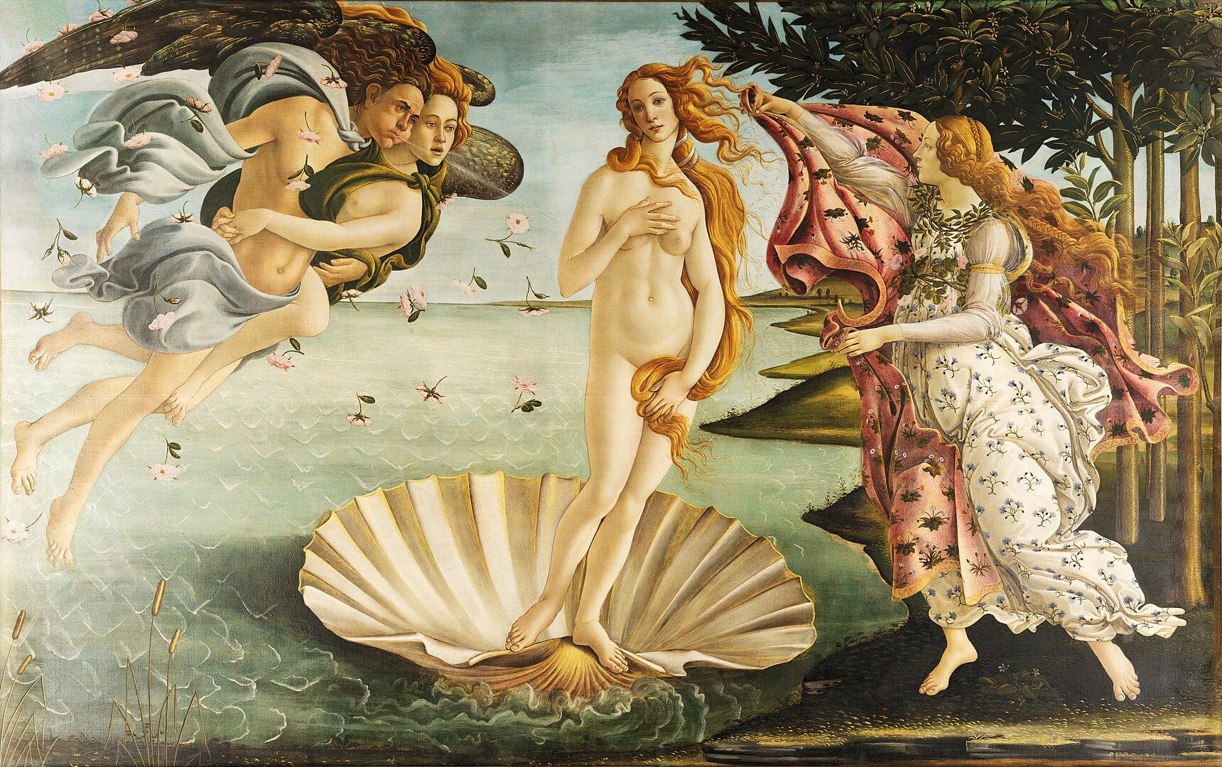
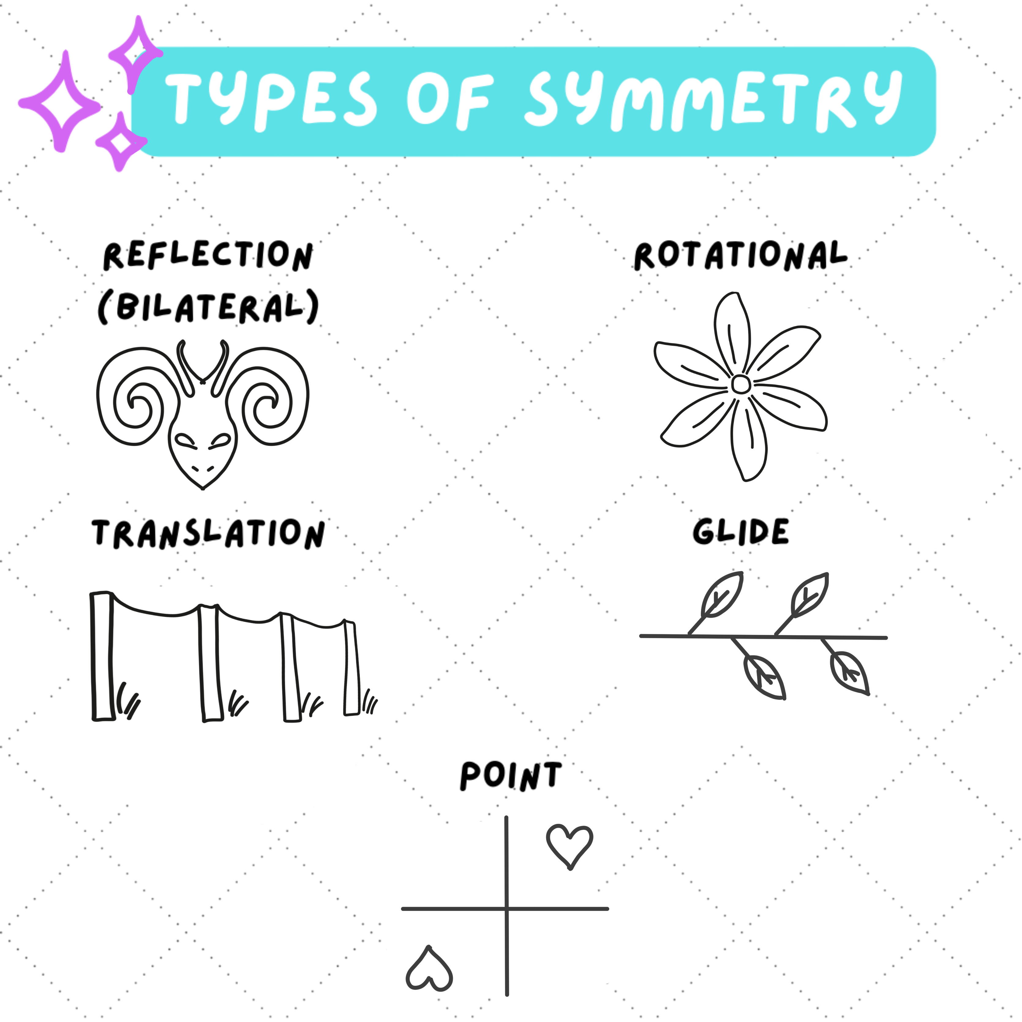
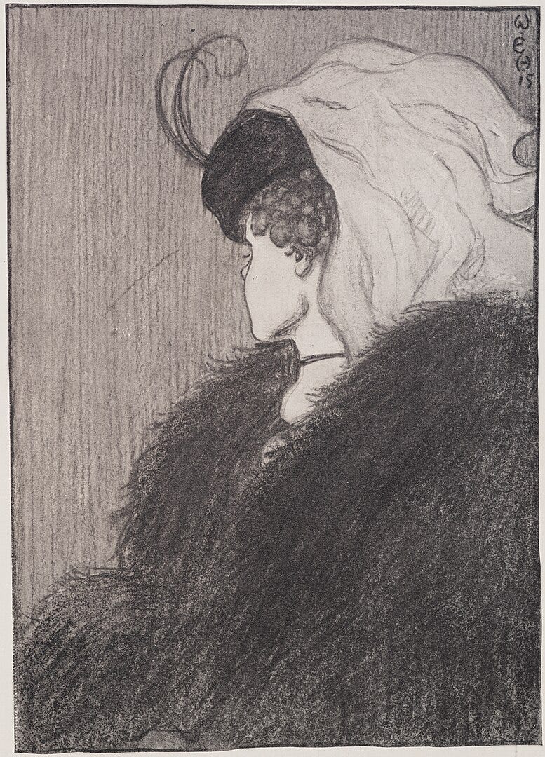
But even if our subject can be unstable, the visual equilibrium, the so called balance should be more or less stable. This means that the perceived weight must be evenly distributed. Perceived is a key word here because if we have a big, white circle on the left and a small red circle on the right since the latter is bolder it looms larger in our eyes. There are three types of balance: symmetric, asymmetric and radial. Symmetrical usually looks unnatural because it is difficult to achieve, and radial look the most intentional. Most often, we will be working with asymmetrical composition. Larger elements are heavier, as well as darker ones. As far as the balance is concerned, best is to lean on our intuition.
In that case, we can rely on our knowledge of the organization of space.
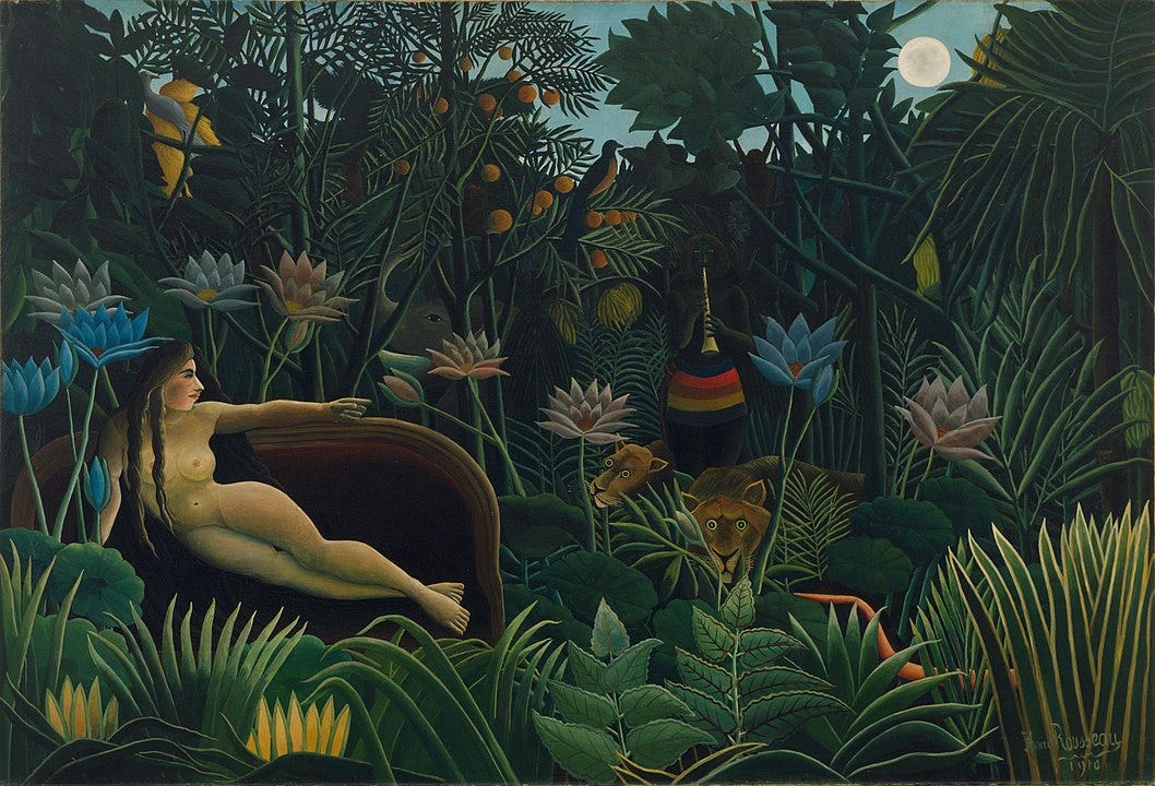
Generally, in a painting we have positive and negative space, also known as figure and ground from gestalt psychology. The positive is filled with our object, the negative also called white space is the surrounding empty area. However not all composition have this clear delineation. Then we are talking are foreground (in front) and background (at the back), even sometimes adding midground. If our main focus is in the foreground, this creates a sense of intimacy, in the middle ground, it is like we are the observer of some unfolding spectacle and in the background, we get a sense of mystery.
But not all paintings have such sharp distinction: some are 3D but 2D spaces are also possible. The so called flat style is the opposite of realistic but is very useful because its simplicity is very suitable for clear and undistracted message. That is why it is favored by corporate communication: illustrations for tutorials, articles and such.
On the contrary, when we have to share a complex and layered message, we have to create the illusion of depth. This can be done in several ways:
shadows
size
blur (diffused edge)
overlap
foreshortening.
To achieve this distortion effect, known as foreshortening, not just for one object but for the whole scene, we should familiarize ourselves with the rules of perspective. Depending on the level of illusion that we wish to achieve we can show our object in 1-point (only one one plane is realistic, looking straight ahead), 2- point (two planes are realistic, looking at an angle) or 3- point (all three planes are realistic, looking up or down). If we pretend we are not human, we also have 4-point perspective, also called fish-eye view, where we use curved lines to get the effect that we are looking at multiple directions at once (each individual part looks realistic but the whole is bizarre). Of course, we don’t have to be realistic, then we can use not a perspective but an isometric projection (but more on than in the future).
But what may be easier is to overlap our objects: if one is in front of the other, surely there are layers even if they don’t look as the real world.
Also the things that are closer are also clearer. The atmosphere that separates us from an object will make its edges look fuzzier, paler… especially if it is polluted with exhaust, sand specs or similar.
Another great enhancer of depth are the shadows, both form shadows that suggest that our object has some peaks and valleys and cast shadows that suggest that the object exists inside a space.
And lastly, size. The same object but smaller means that it is farther. And if an object that we know that is smaller seems the same same as another that is much bigger, we know that it is closer.
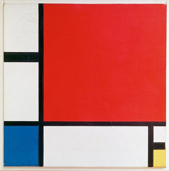
In any case what constitutes most of the space are shapes. For an aesthetic composition, a first consideration is to have a variety of shape sizes: big- medium- small. They can be either geometric (circles, rectangles and triangles) or organic, also called biomorphic which are the shapes of natural things such as leaves, rocks and puddles for example. They can also represent real objects such as cats, cups or clothes or be abstract such as stick figures, icons and symbols but also random shapes. They can be haphazardly situated or follow a determined direction.
Whatever shapes we choose we must observe the principle of alignment. This is usually an invisible line, a triangle of other formal structure that underlines our composition. Even if the viewer is not consciously aware of it, we notice a certain elegance and trustworthiness.
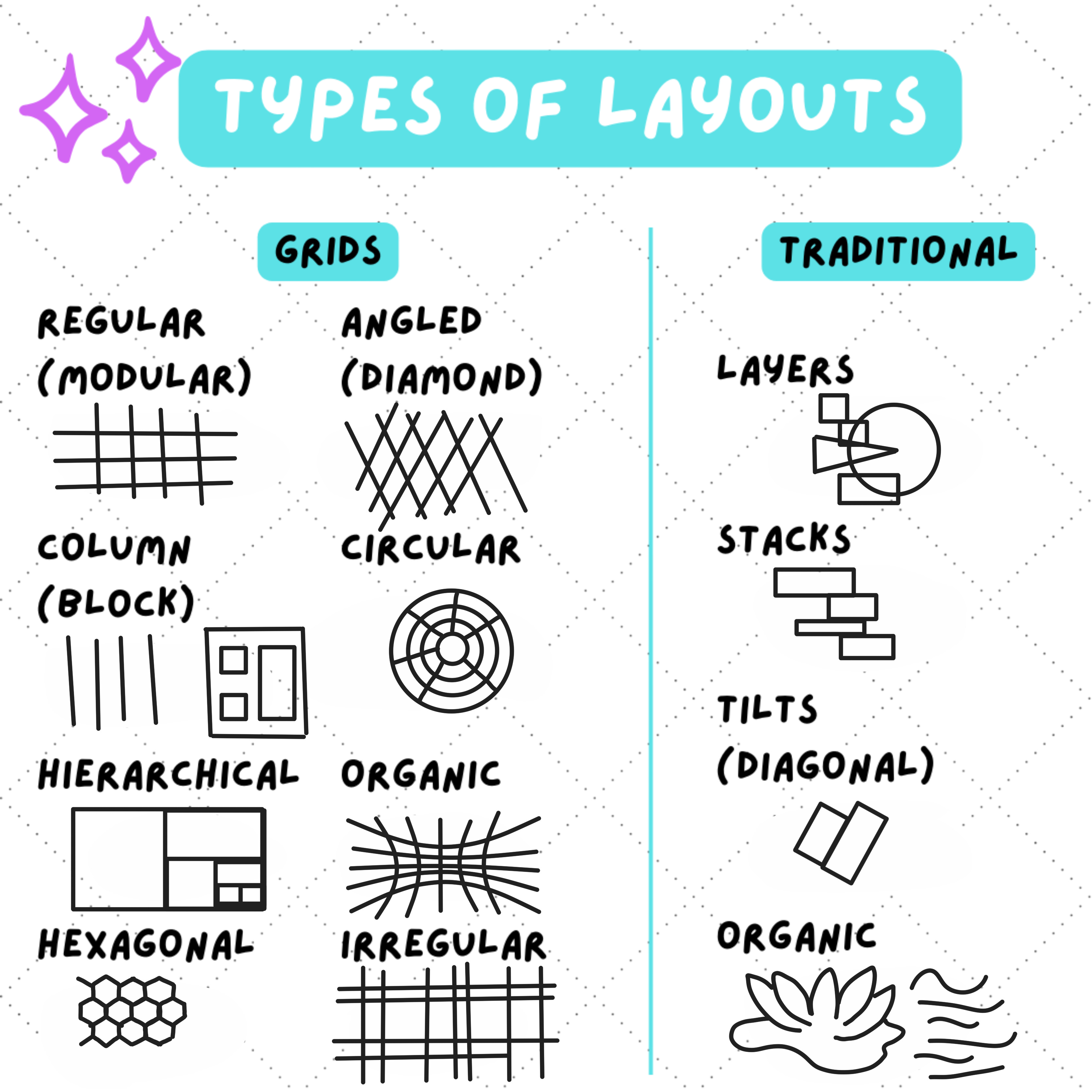
Layouts can be grids or traditional. We rarely think of a painting as a grid but what is the rule of thirds if not a grid. Still, there is clearance for other options too.
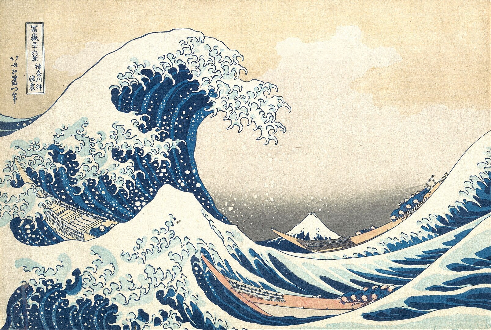
We have no choice but to notice the bigger object first: we will see the giant wave and only later the fisherman’s boat. Even if in real life two objects can be roughly equal, we can use scale to show which one we should pay attention to. The same goes for proportions. That’s the reason that in anime for example the heads are bigger: on the face we see the emotions which are primordial for humans.
Besides emotions, other important information that we aim to glean is the relations. People who stand closer are usually part of the same group. The same applies for objects. Proximity means that grouping visual elements suggests that there is a deeper connection between them. It is more powerful than likeness.

Great, so far, we have taken care of making our art piece pleasant and harmonious.
But isn’t it a bit… boring?
After all, to be alive is to not sit still, to look for the drama.
Our most useful tool to stir the emotions is contrast. The most heartbreaking moment comes right after we think we have the day of our dreams. The sweetest bread is eaten right after we have put the strenuous effort to climb the mountain. The most gorgeous fireworks needs the darkness.
To make our composition exciting we have to add some variation to our scene. Good place to start is with the values as this also greatly improves the readability. And we are sometimes scared to choose bolder, wide-ranging colours because they might look unnatural or the opposite, our colours may be all too saturated.
Another area to check are the shapes: if all our shapes are pointy, we lose the softness, if all are shapes are square, all might look stable but lifeless, if we don’t use organic shapes in our landscape, we are on another planet.
And finally, putting the emphasis on one message, one symbol, one idea is the whole point of composition. We can do it by establishing a clear hierarchy. The most important elements are underlined or distinguished in some way, and respectively the lesser element remain out of the spotlight. Achieving such focus, as we already said can be done with the size, the detailness or the contrast we apply.
Here we can rely on our psychology, in particular knowing how the human perception works. As applied to art, these are called the Gestalt principles or laws:
The first one, figure and ground states that one part stands out because the other part which we deem not so important recedes. This can be achieved with contrast of values, size and detailness.
The law of order means that no matter the mess in front of our eyes, we will try to find patterns, connections or some general, hidden organization.
Simplicity means that we always perceive the object or shape their simplest explanation first. For example, if we see eyes peaking from the corner, we will think it is some creature and not some googley eyes glued to a ball which might be the case.
Another law that deals with ambiguous objects is multistability. If we are not sure what we see, we switch back and forth between alternative interpretations.
That is because of the law of Prägnanz that states that we prefer things that are simple, clear and ordered.
Symmetry tells us that we are dealing most likely with parts of the same object.
Invariance is our ability to recognize simple objects no matter their rotation, translation and scale.
Another principle that allows us to quickly make sense of our environment is emergence: we identify the whole before the parts. From the gleaming eyes and an ear, we can imagine the whole silhouette of the panther.
Similarly, closure (reification) concerns the brains ability to fill in the gaps in any shape or detail which is not present but suggested in the image.
The next one, continuity also shows our willingness to not see separate objects but a whole. The human eye continues to follow a path that seems to be formed by similar object even when it is broken by some oddity.
Similarity means that elements that are similar are perceived to be related.
Proximity means that elements that are closer are perceived to be related.
Parallelism means that elements that are parallel are perceived to be related.
Common fate (synchrony) means that elements that move or look in the same direction are perceived as related.
These affinities can be combated with common regions: an enclose around some of the objects sets them apart, even if they are related because of some of the properties that we saw just now.
Focal points reminds us that we cannot concentrate on multiple object at the same time. As artists, it is our task to decide on where to direct the gaze of the viewer.
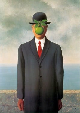
Past experience means that any of the previous concepts can be overwritten by a traumatic or wonderful past event or association. For example, if a dog bit us, no matter the softness and cuteness of the dog on the canvas, we might be scared. Or if a necklace was a gift from a dear granny, we might wear it fondly even if for everyone else it looks ugly.
And that is the unique strength: our experience, our point of view.
No composition is the same, no single rule can give us the answer.
We have to tinker and find the most fitting view.